Add a responsive feature for mobile and desktop custom template e-mails
Please add a responsive feature for mobile and desktop custom template e-mails.
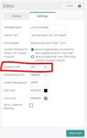
At the moment it is only possible to configure the width for your desktop view.
It is currently not possible to configure the width for a mobile view separately.
The width must always be specified in pixels.
I recommend the following sizes for desktop/mobile views:
Desktop view: 600 px
Mobile view: 300 px
Please add that you can specify the width in percent, so that the width automatically adapts to the respective device:
Responsive view: 100%
So it adapts to the device and always fits.
If you have any questions don't hesitate to contact me.
I lool forward to your feedback.
Thanks!
Best,
Mario
